September 19, 2024
 5 min reading


The visual elements play a crucial role in the design of e-learning, and as cores are a key factor in the process. The correct core selections can help your course have a professional aspect, reinforce brand identity, define the content and at the same time help students process and memorize information. But with so many options available, how do you decide which cores to use? In this article, we share some simple tips to create a palette of cores that is attractive and causes a positive impact on your audience.
1. Consider your branding directors
Some organizations require that their online courses use a specific set of brand cores. If this is your case, the most difficult part of creating a palette of cores has not been solved for you. However, to use these cores effectively, there are some considerations to make.
First of all, you do not need to use all the cores of the brand guide. Using too many cores can overload visually or design. Many core palettes include just five cores, like this example.

There is no way to simplify or core scheme. The 60-30-10 rule, which is generally used in interior design, also works for e-learning. This rule suggests the use of:
- Primary core – used in 60% do tempo
- Secondary core – used in 30% do tempo
- Highlight line – used in 10% do tempo
This approach helps to visually balance the project and keep the design clean and minimalist.

Secondly, if some brand cores are difficult to work with, try creating a monochrome palette. Select a main color and use different tones and color variations to maintain consistency and visual cohesion.

2. Inspire-don't worry about content
If you have more freedom in design, you can use your own content theme as inspiration to define your core palette. As cores we can evoke different emotions and associations, and using the content as a guide can help define the right thing for your audience. For example, when creating a course on civil construction safety, it may be more appropriate to use yellow, orange and red as the main palette cores.
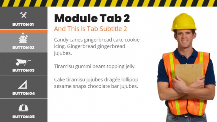
These cores are generally associated with construction equipment, and choosing a scheme related to the content can help students connect better with the material.
View the course on the link: https://elearningdesigner.com/storyline/construction-starter/index.html.
3. Look for ideas from online sources
If its content does not suggest an obvious core palette, technology can be an excellent ally. There are several tools online that offer core palettes, many of them free. Here are some sites where you can look for inspiration:
- Coolors – Create a palette or explore the trends
- Canva – search by word or word-topic
- Adobe Color – manage themes or search by core palettes
- Design Seeds – use palettes pre-created by designers
With the help of these tools, you can guarantee that the chosen cores work well together and contribute to the harmony of the design.
4. Extracted cores from existing images
Sometimes, you use high-quality visual themes, such as images, before defining a palette of cores. In this case, use some of these images as a starting point. When you use the cores of an image to determine your palette, or course you tend to have a visual unit, because the cores complement each other naturally.
If you are using or Storyline 360, you can use the persistent core selector to select cores directly from a photo and create a custom palette without interrupting the work flow – a true gain of tempo!

If you don't know which cores to choose from, you can download them on sites like Colormind or iColorpalette, which automatically identify the dominant cores and create a palette for you.
Accessibility and contrast
These are just some ideas to help you choose a palette of cores for e-learning. However, I know that an attractive core palette does not guarantee that it will work well in an online course. Before starting to draw, check whether the colored cores have sufficient contrast – or, for example, the brightness difference between the two cores. Contrast is essential to ensure that students can see and interact with critical elements of the course, such as navigation buttons, backgrounds, and texts.
You can use this contrast checker to ensure that the chosen cores are suitable for your online training. The greater the contrast, the easier it will be for students to view and interact with the content.
Do you want to know more about how to improve the visual design of your e-learning? Fale with a specialist Software.com.br through the e-mail consultaria@software.com.br and discover how or Articulate You can transform your course into a more efficient and accessible learning experience.